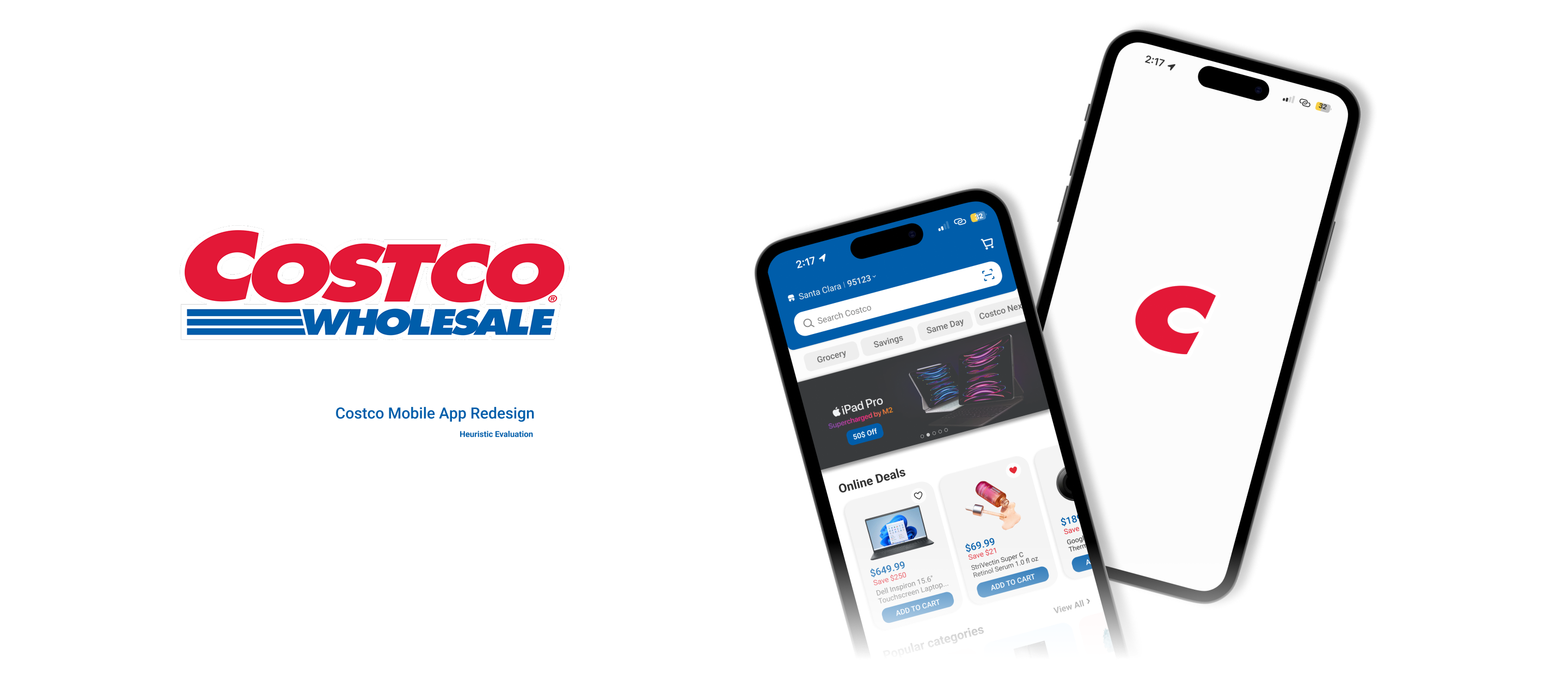
Costco Mobile
App Re-design
The goal of this project was to redesign the Costco App based on user feedback of the current design. We focused on redesigning the homepage to purchase flow, return & exchange, and adding a scan & go function. This was a team project where we worked together to conduct user interviews, gather feedback, and iterate the design. Each remember focused on a specific user flow, mine was the Return & Exchange flow.
Skills Leveraged
Tools Used
Defining the Problem
Costco’s mobile app offers access to a vast product catalog and member-exclusive features, but the experience can feel overwhelming and unintuitive, especially for first time or infrequent users.
Key usability issues include unclear navigation, difficulty locating essential features, and a cluttered interface that slows down common tasks like searching for products or checking membership information.
Goals & Objectives
The goal of this redesign was to streamline the Costco mobile experience by improving navigation clarity, simplifying key user flows, and creating a more approachable, modern interface—while staying consistent with Costco’s established brand identity.
- Improve navigation clarity
- Reduce cognitive load of homepage
- Make return & exchange experience more streamline
- Have a simple way to buy singular items for those in a rush
- Modernize visual design while respecting Costco’s brand
The Research
User Insights
Our team began with a usability audit of the existing Costco app, identifying recurring friction points through heuristic evaluation and user feedback from app store reviews. We also analyzed competitor retail apps to understand common patterns for mobile shopping, navigation, and membership access.
Key Insights
- Do you shop online or in-person?
- Why do some of them shop online?
- Why do they shop in-person?
- Why do they shop at Costco?
- What do they usually shop for?
From here we were able to focus our efforts on three main findings:
Preference for In-Store Shopping
- Have better shopping experience
- Not aware of online-exclusive deals
Common Purchases
- Groceries, clothes, and household essentials
- Larger items such as
bedding, appliances,
and furniture are more commonly purchased online.
App Usage
- All interviewees use digital membership card
and QR codes for gas station payments - All of them use for browsing for deals or sales
- 50% Same-day delivery service (Instacart Partnership)
for checking inventory and avoid the crowds
Competitive Analysis
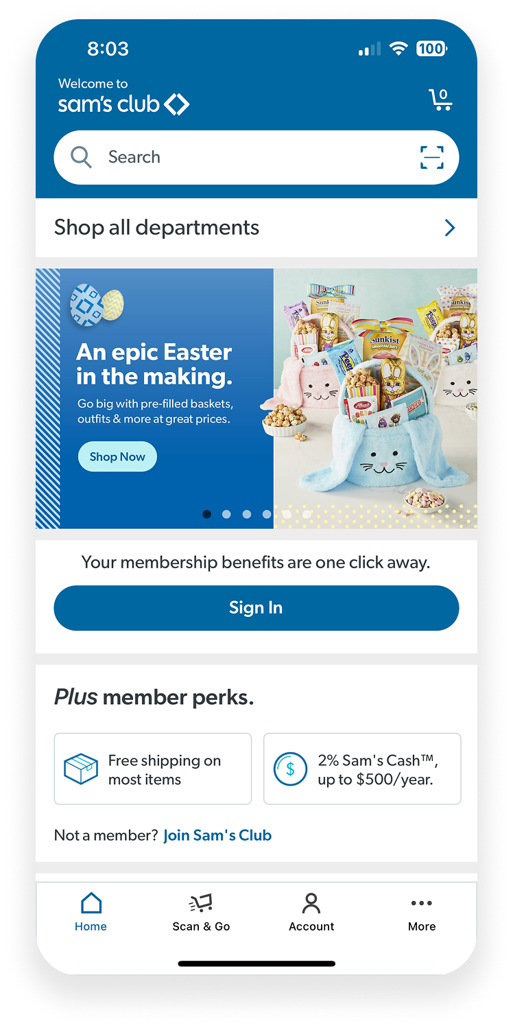
Sam's Club is Costco’s most direct competitor, being another membership-only warehouse chain selling bulk items for a low price.
Strengths
Cheaper membership fees Access to main brands More general selection Scan & Go
Weaknesses
Lack of specialty and organic products Lack of premium brands Fewer locations
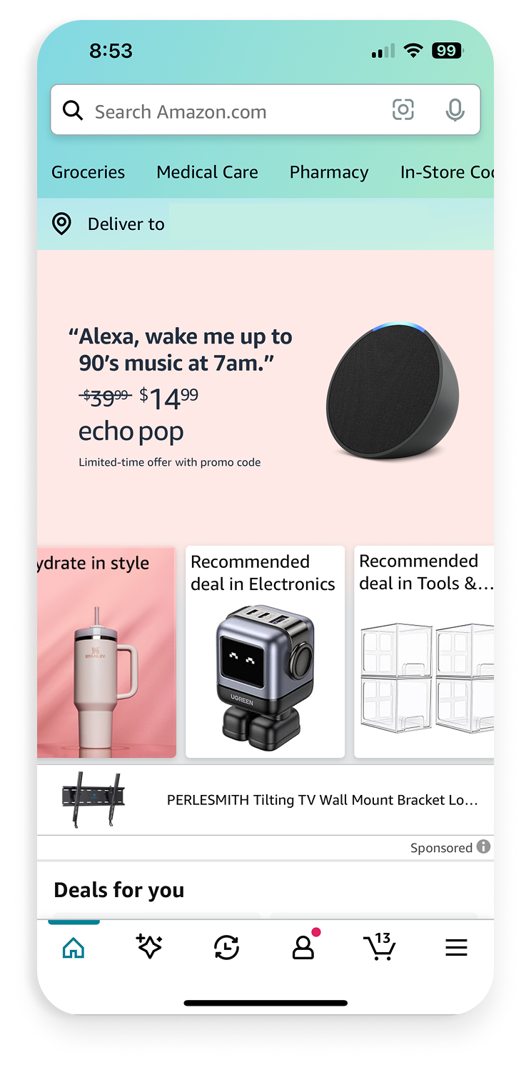
Amazon is in the same vein of Costco is terms of membership and variety of products. However, Amazon carries third-party sellers in its entirely online experience.
Strengths
Wider variety Speedy delivery Range of quantities
Weaknesses
No guarantee in quality More expensive (cannot match bulk value)
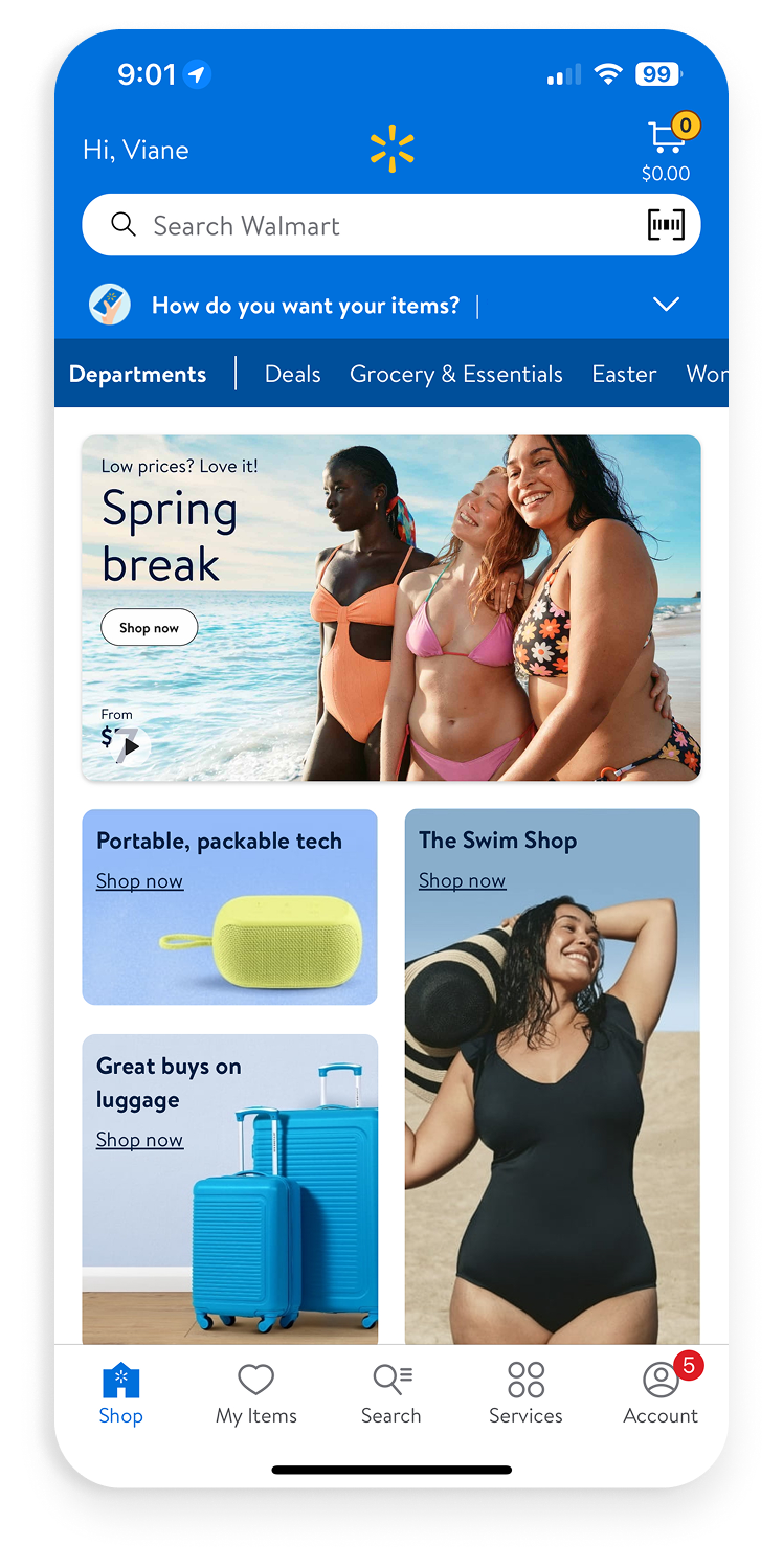
Walmart and Costco are both go-tos when saving on groceries and essentials. Similar to Amazon, Walmart opens its online presence to third party sellers.
Strengths
No need for membership “Standard” sizes Walmart’s Great Value Variety of brands
Weaknesses
Lack of quality More expensive
The Design Process
Our team began with a usability audit of the existing Costco app, identifying recurringfriction points through heuristic evaluation and user feedback from app store reviews.
We also analyzed competitor retail apps to understand common
patterns for mobile
shopping, navigation, and membership access.
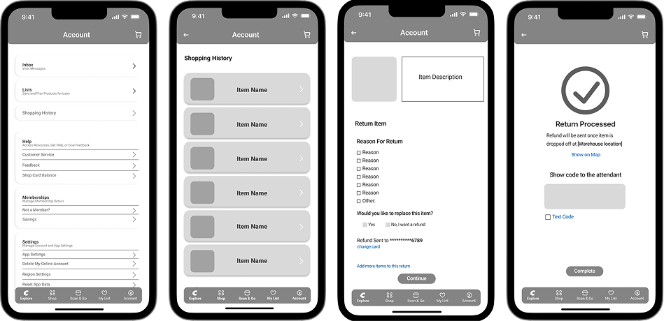
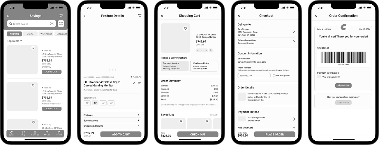
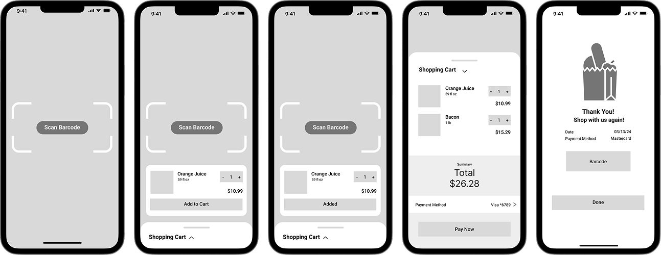
Low Fidelity Flow
We mapped key user flows for common tasks such as browsing products, checking membership details, and completing a purchase. Low-fidelity wireframes were created to test layout and information hierarchy before moving into high-fidelity design.
Return & Exchange
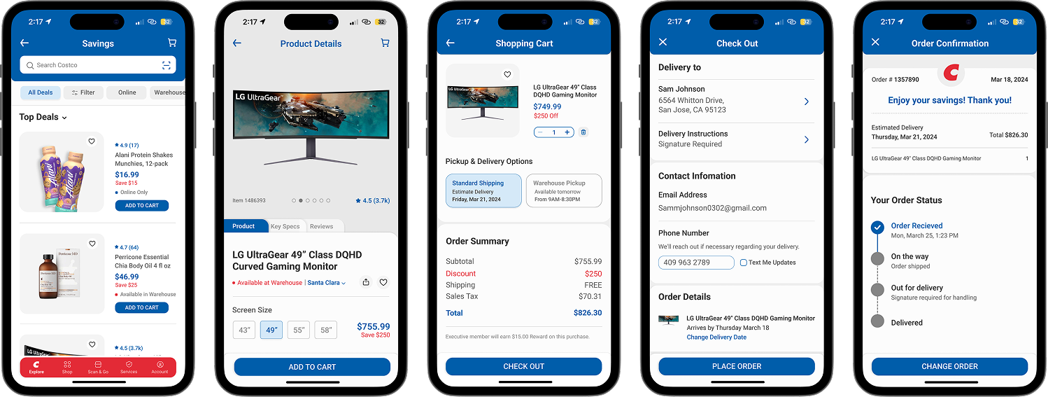
Browse & Purchase
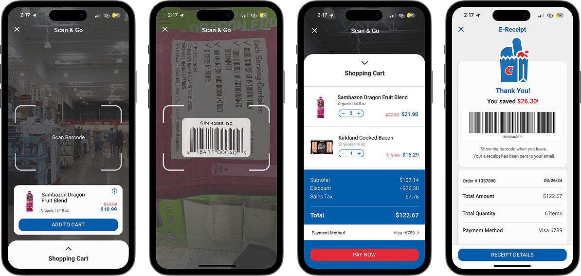
Scan & Go
Final Designs
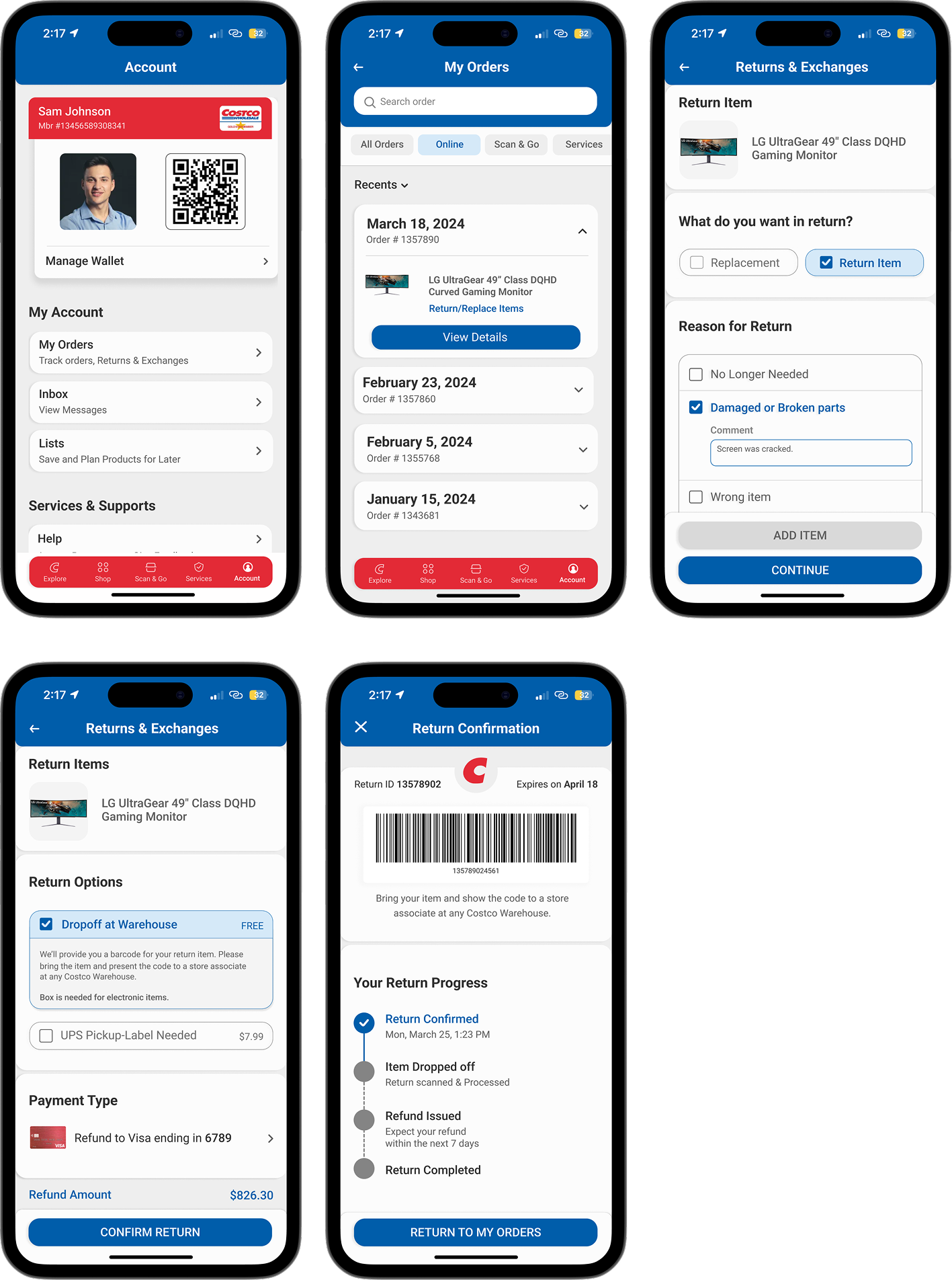
The final redesign introduces a clearer navigation structure, improved visual hierarchy, and a more consistent UI system.
Key actions are surfaced more prominently, spacing and typography were refined for readability, and the overall interface feels more modern and approachable while maintaining Costco’s recognizable branding.
Return & Exchange
Browse & Purchase
Scan & Go
Insights
Overall the feedback of the final design was positively responded to with a few notes to further improve the design.
Browse and Purchase
Overall the feedback of the final design was positively responded to with a few notes to further improve the design.
Return & Exchange
It was suggested to have more detailed order boxes as well as having a variety of option for return “reason.”
Scan & Go
Suggested to have multiple tabs for multiple items, have the option to delete or add more items, and return to the scan button.